MRCEM Success
Boosting speed and refining UX to power continuous brand growth.
A high-performance MedEd platform redesign that strengthened MRCEM Success's position as the UK's leading exam-prep destination for emergency medicine doctors.

The brief
Founded in 2015 by UK doctors, MRCEM Success is the established online revision platform for the Royal College of Emergency Medicine certification exams (MRCEM Primary and Intermediate). Over a decade of growth had taken them past 22,000 doctors and built a deep question bank, but the marketing experience hadn’t kept pace with the product.
New prospects landing on the site were greeted by slow page loads on hospital wifi, dated visuals that undersold the platform, and a confusing path between the homepage, the free demo, and a paid subscription. The team needed a brand and front-end refresh that would protect organic search rankings, accelerate the conversion funnel, and signal that MRCEM Success is the gold-standard MRCEM revision resource - without disrupting the question-bank experience that 22,000 existing customers depended on.
What we did
We approached this as an end-to-end UX, brand, and Core Web Vitals project rather than a cosmetic refresh.
- Audience research - interviewed prospective and current subscribers to map the realities of doctor revision: late-night sessions, on-shift study breaks, mobile-first study windows.
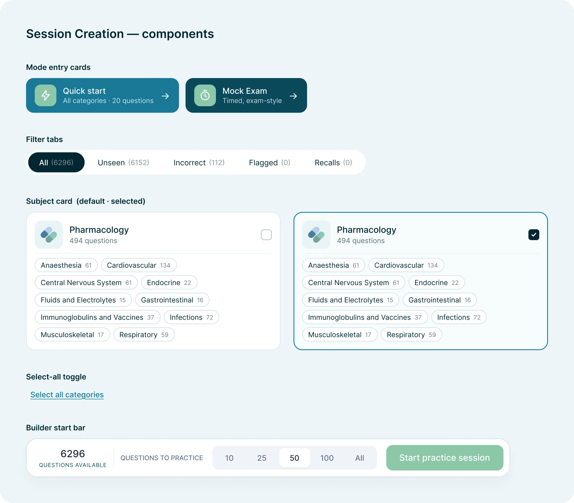
- Conversion-focused IA - restructured the marketing site around a clear free-demo-to-paid funnel, with separate prep pathways for MRCEM Primary and Intermediate audiences.
- Brand evolution - modernised typography, colour, and component design to match the trust signals expected of a clinical education product.
- Performance overhaul - rebuilt the marketing front-end on a fast, accessible stack hitting Core Web Vitals on mid-range Android, with critical CSS, lazy-loading, and aggressive caching.
- Accessibility - WCAG 2.2 AA across the new templates, including high-contrast modes for tired-eye late-shift studying.
- Seamless handover - preserved the existing question bank and dashboards, wrapping a new marketing layer around them so subscribers experienced zero disruption.
The result is a faster, sharper, more credible front door to a product that was already doing the work - and a brand presence that finally matches the depth of the platform behind it.